So I chose copyright strike because as someone who watches a lot of YouTube, I hear a lot of YouTube based drama and most of it comes from false copyright strikes that put these Youtubers livelihoods at risk and as a small time Youtuber myself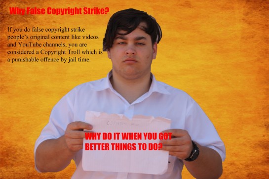
Author Archives: zaneczora
Contact Sheet
I choose this photo since it seems to be the one most relevant to the current situation as kids these days are false copyright striking YouTube channels which are putting the livelihood of most content creators of that channel at risk. I like this photo since it shows the punishment you would get for false copyrighting channels as it is considered to be breaking the law, with one of the punishments being jail time.
Planning (in typing)
I choose Copyright as Copyright fights are a big problem with YouTube right now and most of these fights start with fake copyright claims which I submitted by “trolls” and these “trolls” are usually little kids so this poster should inform them about the troubles of doing things.
I plan to use either a pile of money and one of those court hammers so I can use it to symbolize the possible costs and issues of breaking copyright/fake copyright claims. I will use a plain white background so it’s easier for me to crop and put it onto a more rustic background like the one below. I will use dark reds and yellow for the text to make it stand out more.

If I can’t get the props I need, I will just use a pile of money with a white background.
Proposed Layout Of Anti Cyber Bullying Poster

Final Magazine Cover

Definations Two
Typography: The art and technique of arranging type to make written language legible, readable, and appealing when displayed.
Body Copy: Main text part of an advertisement or any printed matter that provides the ‘meat’ of the communication.
Display Type: Large, bold, or eye-catching type used for headings or advertisements
Hierarchy: The order in which the human eye perceives what it sees. This order is created by the visual contrast between forms in a field of perception.
Kerning: The process of adjusting the spacing between characters in a proportional font, usually to achieve a visually pleasing result.
Leading: The distance between the baselines of successive lines of type. The term originated in the days of hand-typesetting, when thin strips of lead were inserted into the forms to increase the vertical distance between lines of type.
Tracking: Adjusts spacing uniformly over a range of characters. In a well-keened font, the two-dimensional blank spaces between each pair of characters all have a visually similar area.
Widows: A widow is a word or line of text that is forced to go on alone and start its own column or page.
Orphans: An orphan is a single word at the bottom of a paragraph that gets left behind
Magazine Prototype (NOT PROPER ONE)
Fonts
Serif: A family type. Usually are identified by the little “ticks” and strokes attached to the letters. Usually used in written stuff like newspapers and books.
Sans Serif: Serif fonts that are identified without the strokes attached to it. Usually used in webpages for a more cleaner look.
Novelty/Decorative: Very niche use as they are usually considered to be the uglies of the fonts. Only use when necessary like for a Art/Fashion magazine
Script: Consists of thin lines and curves to replicate the look of an human signature. Often used for a side title or in things more directed to females as it represents slim and sexy.
Do’s and Dont’s:
-Never use more then 3 different types of fonts
-Never use more then 2 different fonts from the same family
-Never use Novelty font unless it really fits your theme of your design.
Fonts I’ll Be Using
For my magazine which is focused on men’s health, I’ll be using the following:
Long Island for it’s boldness and overall style for the title
Heather for two of the main sub titles as it stands out.
Ariel for the other sub titles as it looks neat and clean
Cover Photo Inspiration
")


